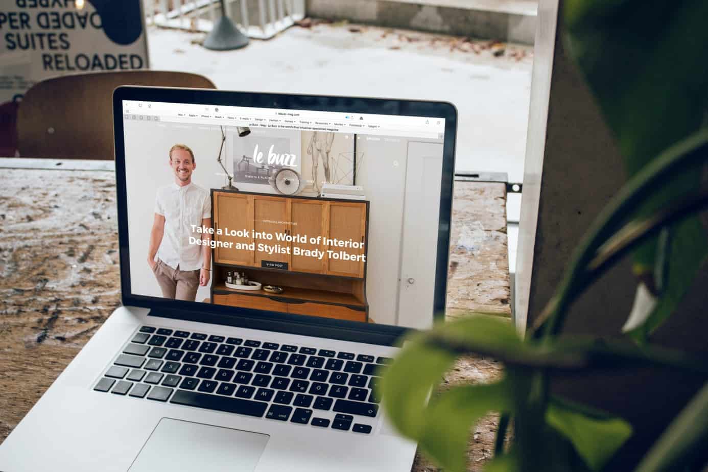
One of the most important aspects of success in the online marketplace is a website that is fully optimized to cater to the user. The user experience is one of the most crucial considerations in web design, as even just a single mistake can cause a large drop in conversions, and therefore, profits.
Even a delay of just a single second in a website’s loading time can cause up to a seven percent drop in conversions in 2020. That’s why our web design experts have created this list of the best ways you can improve the conversion rate on your website, taking into account the most important tenets of design in the digital age: convenience, efficiency, and aesthetics.
1. Narrow your pages down to only a few calls to action
Having too many calls to action might generate just enough hesitation in the user to prevent them from moving further in the purchase process. As much as possible, your website must feel more like a path with fewer branching choices than a maze. Basically, fewer clicks mean more chances at positive conversions.
2. Use more images of your product or service
Humans are intensely visual beings. The more real the product or service seems to them, the more likely they are to buy it. This is easily done n a retail store by letting the customer hold and feel the product in their hands. On a website, this is done through high-quality photographs. If it is a software or service, screenshots and images of the service in action might help them feel more comfortable with it.
3. Declutter and welcome the negative space
Not every inch of your website needs to be occupied with information or imagery. Negative space is necessary to better highlight and draw a user’s eye to the relevant information and your calls to action. Having a website that isn’t cluttered will also allow your message to shine.
4. Make it easy to navigate
We’ve mentioned before how the website should be less of a maze and more of a path with few branches. In terms of your sitemap, this means that your website should be easy to navigate. You must make it easy for your users to make their desired purchase and find other products and services relevant to their interests.
5. Use consumer reviews and social proof in your marketing and messaging
One surefire way to get a customer to finally decide that a product or service is worth their money is through reviews from other customers. Having these testimonials, reviews, and other positive feedback accessible to potential customers can push them right to your checkout page.
In conclusion
When it comes to web design, a careful balance must be made between the business’s interests and the user’s convenience. The better the balance is between these two concepts, the more conversions it is likely to get. With the right approach to your web design, you could carve a niche for yourself in the competitive online marketplace.
If you need help with web design in Kansas City, send us a message at Fox Web Creation. We have the expertise and experience needed to help your business succeed and soar to greater heights.


